
Recently, NCS Colour and its Color Prediction Committee predicted that people's color preferences will undergo major changes in 2026 and beyond. After years of dominance by neutral tones, the world is ready to embrace a wider range of color systems. "2026+ Color Trends" reflects this shift, highlighting the increase in vibrant colors while maintaining sophisticated color selection methods.

Forecasts show that people will continue to deviate from the neutral palette of the past. Colors after 2026 will gradually integrate into midtones and high-chroma colors, with red, blue and carefully selected yellow changes dominating. Although the contrast between light and dark tones in 2024 is very sharp, the return of midtones in 2025 has reintroduced balance, and this trend will continue in 2026. Red and blue changes occupy a central position, marking the beginning of a new era of expressive color use.
NCS Color Trends 2026+ is divided into four directions
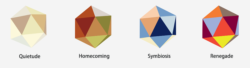
The four main colors represent global color trends in 2026 and beyond. Each main color is paired with five auxiliary colors to form a selected color palette for interpretation by design professionals around the world. The colors filled in the NCS system show a clear pattern:
.jpg "NCSɫ������2026��ɫ��")
Soft white has a low-chroma hue that is cleverly separated from pure white, marking a quiet shift in color preferences. The earthy warm brown provides natural-style tones, laying the foundation for the space with tones that promote family affection and shared experience. The deep blue creates a mysterious, introspective tone that inspires innovation and exploration. Finally, high-chroma red is a bold, eye-catching transformation color that exudes energy and urgency.
01��Quietude
A range of imperfect whites and noble neutral colors that transcend tradition take us into a realm of eternal elegance-a luxury that transcends the norm and soothes the soul.

People are turning to blending traditional luxury with modernity. People are increasingly appreciating natural and refined materials, symbolizing the integration of traditional and modern aesthetics. The use of warm white marble instead of pure white shows that people want to soften luxury into something more down-to-earth and approachable that resonates with the values of sustainable luxury. This reflects an era where "local" and "natural" luxury takes precedence over flashy or man-made materials.

The main color NCS S 1010-G90Y is a limestone white, marble white, with mineral vibration. It is also an imperfect white, a white that transcends conventions and standards. Its light comes from this imperfections. It is a subtle low-chroma light with a slight greenish yellow color. Daylight will enhance this color of green.

During the day, it embraces your ecological feeling. At night, in the yellow light, it will become a statement of luxury. This imperfect white transcends standards and allows us to feel timeless elegance and carefully designed luxury. Primary tones are used on larger surfaces, but are best combined with one or more auxiliary tones. Secondary tones are low, soft and warm, and should be used to frame and/or combine with the main tone in detail.

02��Homecoming
A set of warm and down-to-earth colors reminds us of the new luxury and connection between people. There is a cultural yearning for nostalgia, to get rid of the long-standing white and indifferent minimalism, and to a strong sense of local luxury.

Homecoming is about decorating our interiors with colors, making us miss our home many years ago, when we were allowed to use colors to bring us warmth and comfort. Red and green bring us into a perfectly friendly space that brings us back to our origins and our most important values. Fresh details are emphasized with light blue and red, breaking the comfort and bringing fresh highlights that wake us up and make us realize that we need contrast to feel good!

NCS S 3040-Y30R is the main color. It is a rich leather brown that perfectly blends traditional and avant-garde design. This deep, warm brown blends with the background of earthy, reminiscent of the rich texture of aged leather, the depth of natural wood and the organic warmth of clay. It embodies craftsmanship and timeless authenticity, shows the tactile beauty of old materials, and cleverly hints at the bold and exploratory spirit of the Martian landscape.

This color requires space-it is suitable for growing on larger surfaces rather than small embellishments. To balance and support its depth, it is perfectly matched with nostalgic natural hues, enhancing its earthy, tactile nature. It is a color that is both familiar and forward-looking, providing designers with a unique bridge between traditional stories and future escapism.

03��Symbiosis
Dark blue embraces and entangles several lighter colors to achieve collective growth and coexistence-mutual empowerment, as human wisdom, artificial intelligence and nature unite towards a brighter tomorrow.

The palette emphasizes the coexistence and interdependence of us, humans, nature and technology. We have long emphasized the importance of coexistence with nature and introduced vividness into our designs. Starting with probiicity, we turn to embracing nature and being one with nature-completely immersed in it. Our designs are increasingly focused on creating designs that view nature as a given element.

The main color, NCS S6030-R70B, is dark blue with slight red, reminiscent of the vast space and the mysterious deep sea. This dark blue is very beautiful on larger surfaces, with more detailed borders and details, lower chroma and lighter color, reminding us of all the elements of life that surround us in these environments.

The focus should be to immerse us in this blue color and make us feel relaxed and optimistic. The support palette is enhanced by bright color dots and is ideal for spaces designed to inspire exploration, cultivate collective power, and drive visionary innovation. We appreciate the light colors around us. They make us smile and give us a feeling of happiness.

04��Renegade
Awakening creative rebellion, the peak of this deep red era ignites fearless expression, bold, high-color hues and deep hues boldly challenge the ordinary. This is a provocative, fearless, anti-conformist rebellion that challenges the status quo of a dysfunctional world! We want to feel like we are seen and heard!

We see the peak in the use of high-chroma red, which is both a signal to change and a signal to stop! Traditionally, high-chroma red has been used only for details. However, we see the need to increase the size and use this red color on larger surfaces. But not too big! We balance the use of red with dark or low-chroma browns, which are like the base on which we place red. In this space, red is not enough for the expression we want to achieve. We need other high-color elements and details, dark red, orange and/or very importantly almost neon yellow.

NCS S0580-Y90R is an energy color, a high-chroma deep red that cannot be ignored. NCS S0580-Y90R is the ultimate expression of fearless creativity and bold personality. It is a color that attracts attention, ignites passion and challenges tradition. Inspired by revolution, energy and change, this bright red color is not just a design choice, but a declaration.

This intense tone is ideal for decorative walls, personalized furniture or architectural highlights, injecting an undeniable sense of presence into any space. It evokes bold self-expression and breaks the boundaries of interior and product design. Traditionally, this high-chroma red was used only for small details, but Renegade redefined the rules-the color works on larger surfaces, but always maintains strategic balance.

Looking to the future, the color world is about to usher in a major change. Color trends in 2026 and beyond will get rid of neutrality and embrace colorful. The four main colors will join hands with auxiliary colors to create a new color palette that will guide the design field and let us witness the arrival of a new era of color together.